Android and the curious case of notification orthogonality
- Table of contents
- The situation
- What a mess!
- Proposed solution
The situation (§)
On modern Android, applications can register multiple channels / categories through which they'll send notifications, so that you can configure different types of notifications to behave differently. It's a great concept, but the actual configuration UI leaves something to be desired.
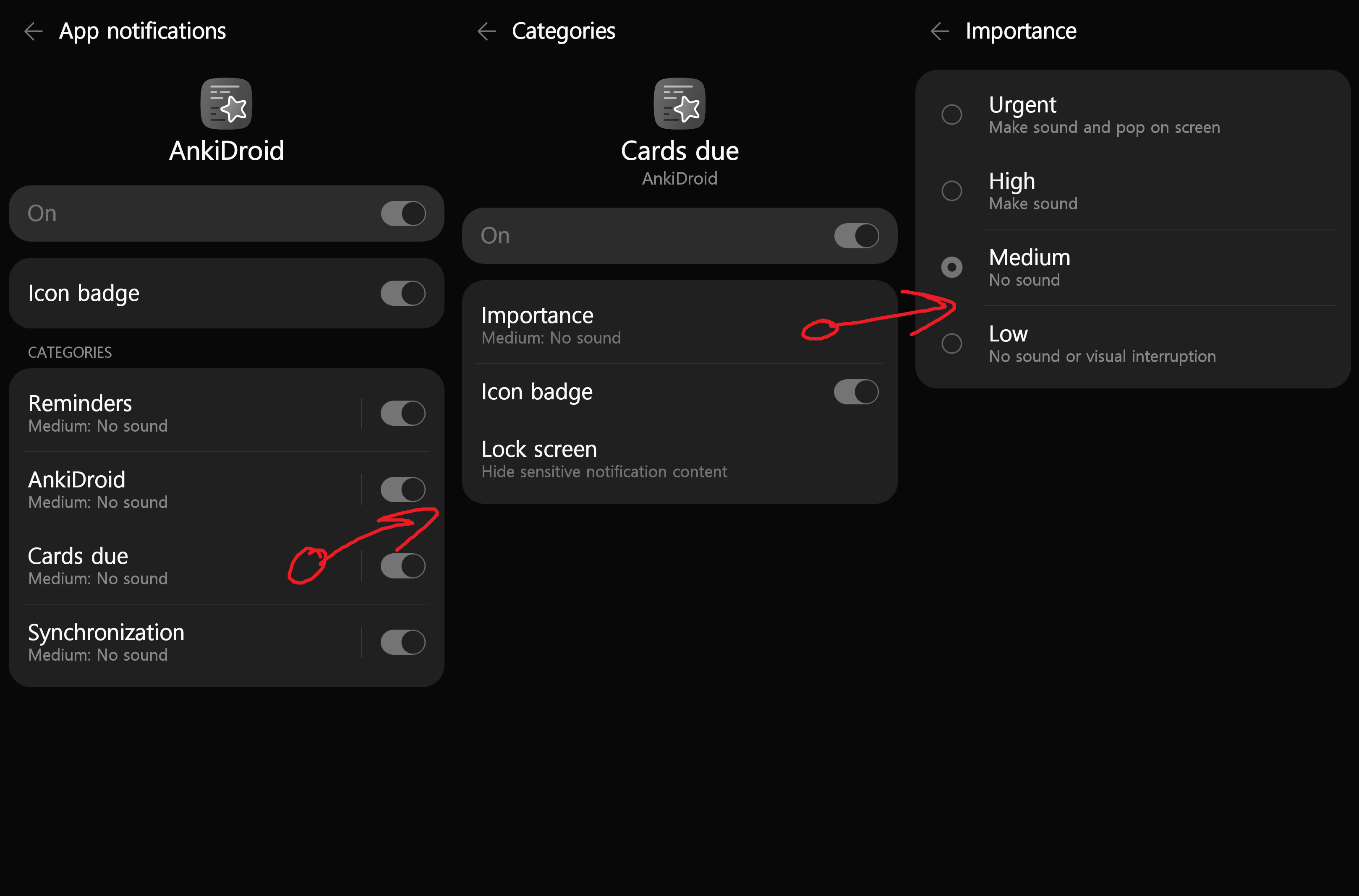
Here's what it looks like to configure an app's notification channel:
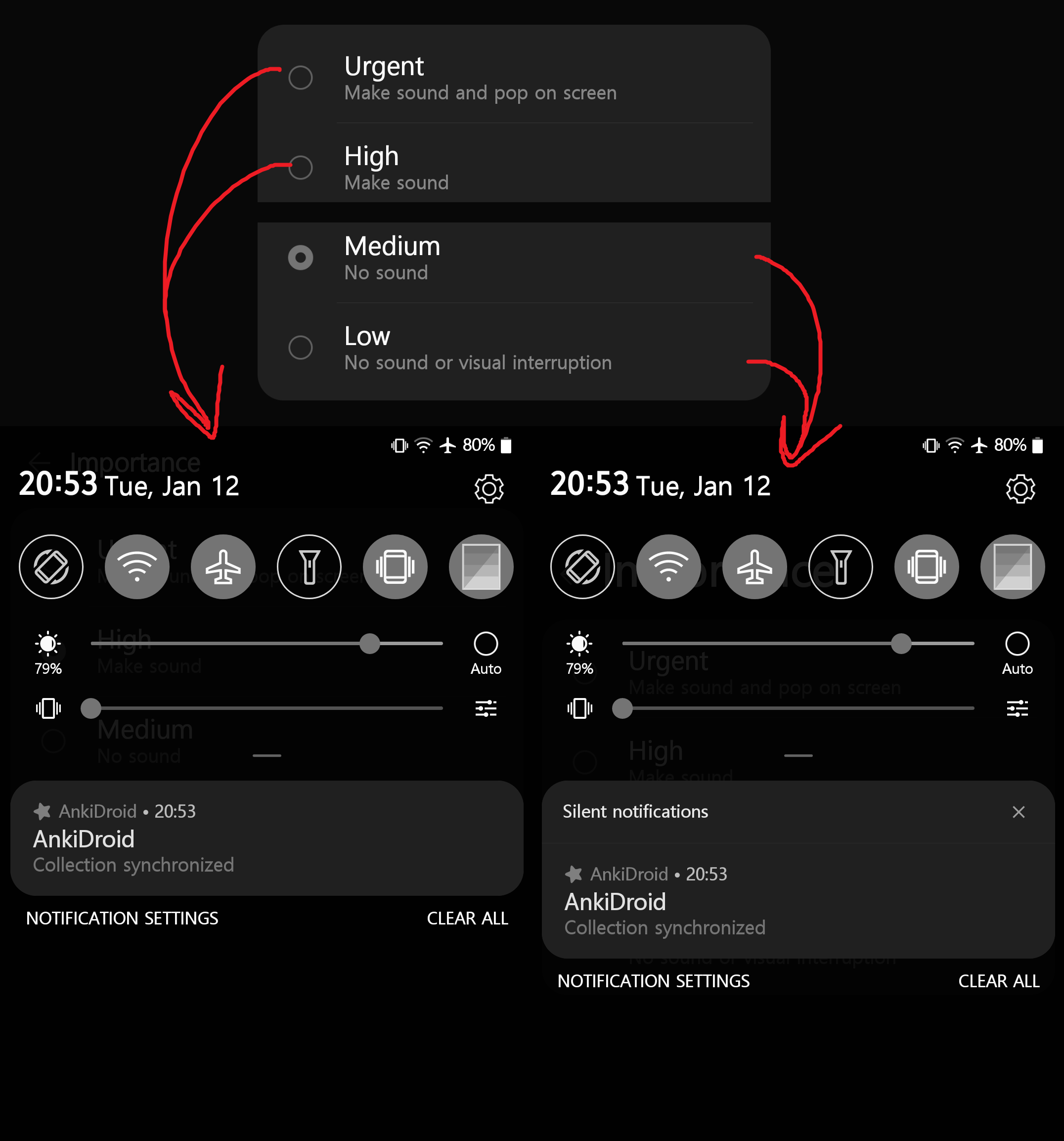
For Medium and Low importance, notifications appear under a "Silent notifications" header on the dropdown:
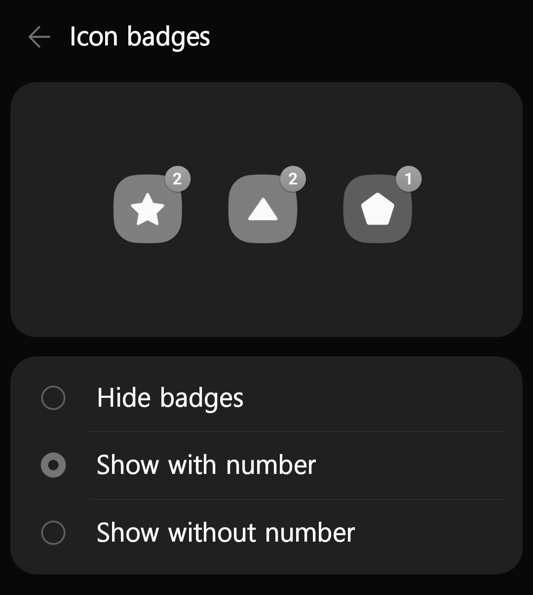
And although the channel menu has an on/off switch for badges, there is a totally separate menu for choosing whether badges are numbers or just dots, because this option applies system-wide:
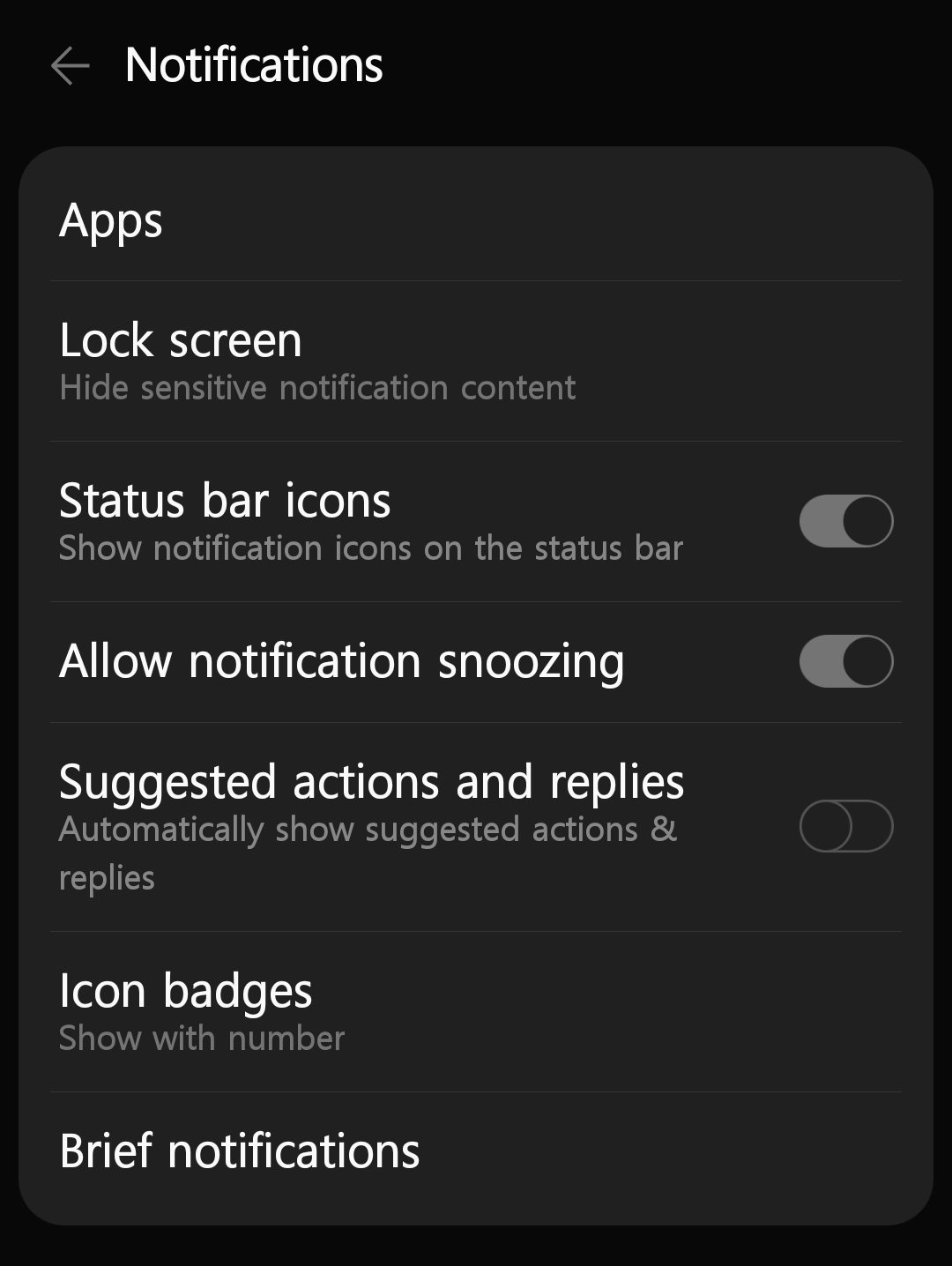
Similarly, if you want to disable status bar icons entirely, that's listed somewhere else:
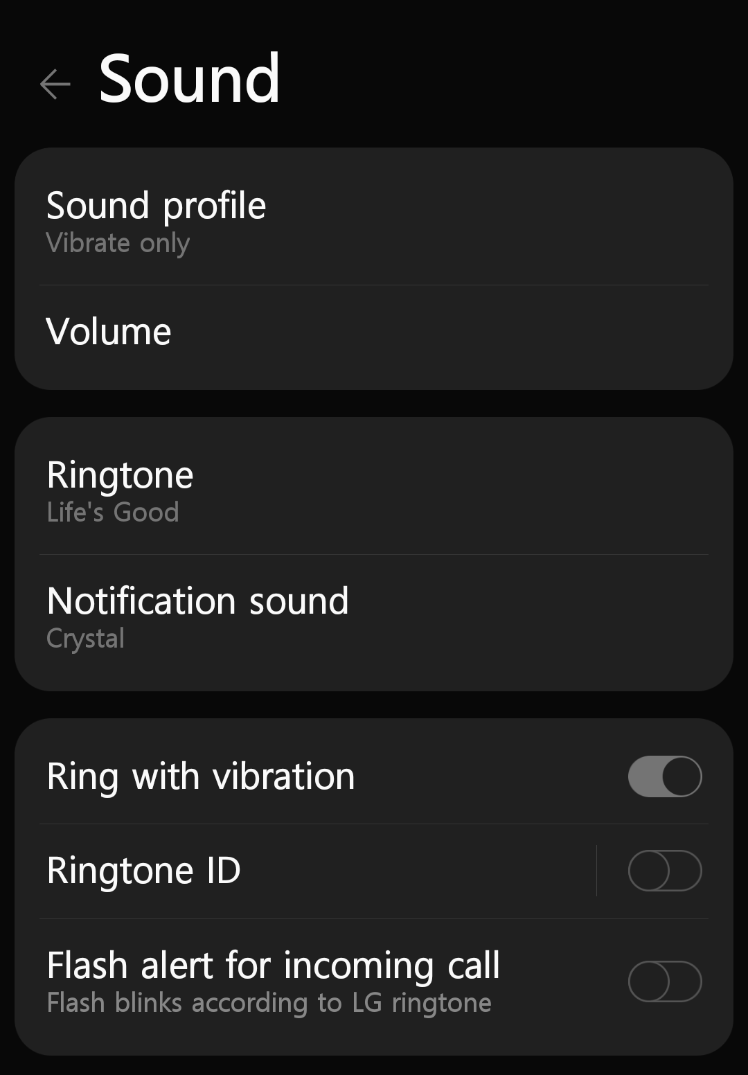
And finally, there is another option that only applies to incoming phone calls that gives you ringing and vibration together.
So, if you want to modify all of the available options related to notifications, you'll have to make a Vernian journey through the operating system and hope you get it done in less than eighty days:
Notifications menu to enable status bar.
App & channel menu to enable the channel.
Channel importance submenu:
| Level | Status bar icon | Dropdown area | Sound/vibrate | Pop up |
|---|---|---|---|---|
| Urgent | Yes | Primary | Yes | Yes |
| High | Yes | Primary | Yes | No |
| Medium | Yes | Silenced | No | No |
| Low | No | Silenced | No | No |
Badge menu to choose numbers or dots.
Sound menu to choose phone call ring with vibrate, because phone calls are special.
Additionally, I think some properties are controlled by the app itself, such as whether to wake the screen or not. During my experiments with AnkiDroid, the synchronization notification never woke the screen even when the channel was set to Urgent.
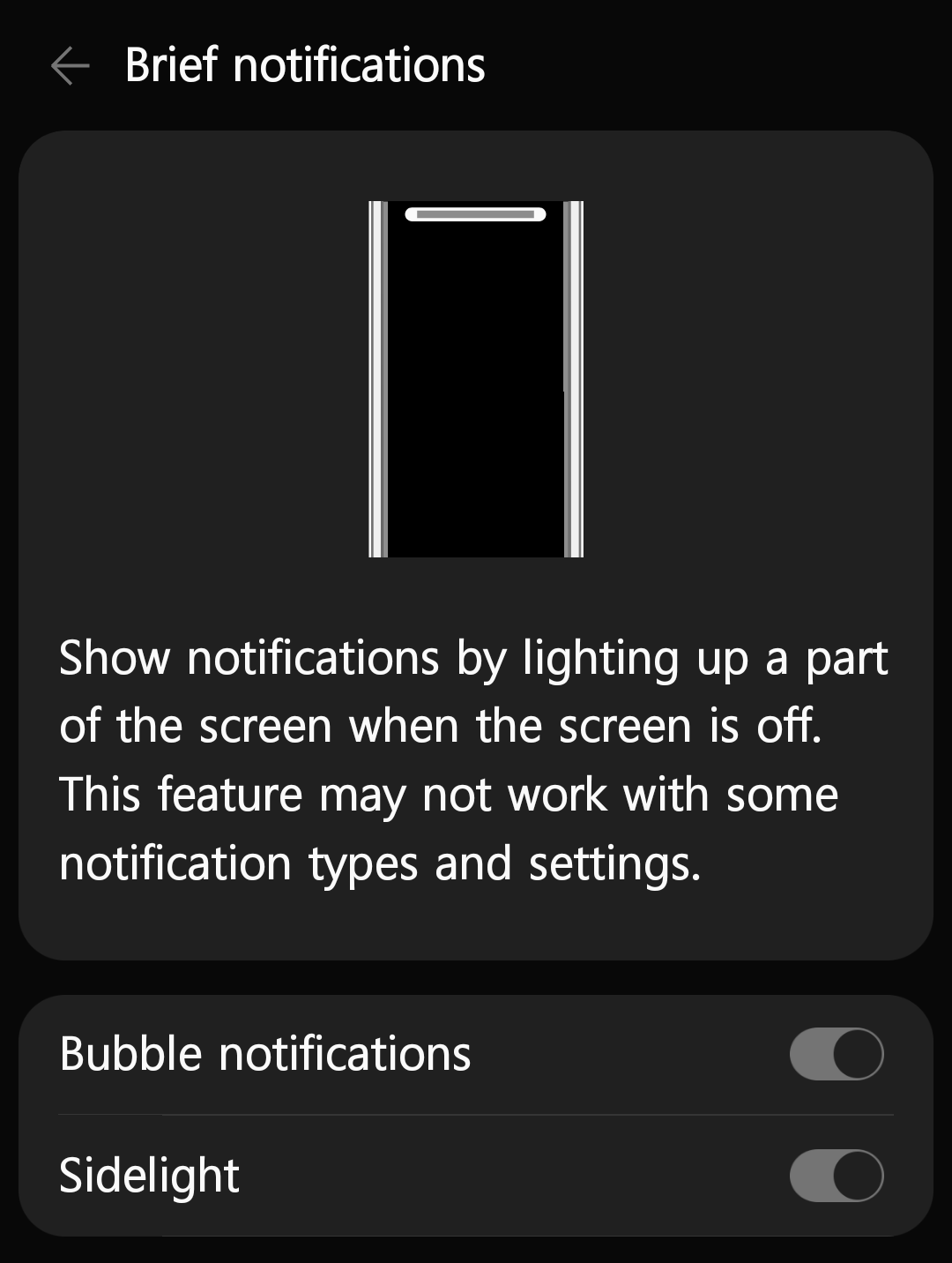
My phone happens to be an LG, and their firmware has some bonus options that only apply to the lock screen, which is located in, you guessed it, a separate menu:
What a mess! (§)
There are two main problems that afflict me every time I want to change something:
1. Mental translation steps: Before I even open the Settings, I've already decided what I want to achieve. For example, "keep this app's icon on the status bar, but disable its sound and vibration". The problem with Android's UI is I have to translate my goal into its terminology of importance levels, so that it can translate that back into the actual outcomes.
In my head, I'm thinking "keep icon, disable vibration", but on my screen I'm seeing "Urgent, High, Medium, Low". Well I don't want sound so I can rule out Urgent and High. Low... hmm, wait, is the status bar considered an interruption? I don't really think of it as an interruption. Not like the popups anyway. Oh, popups only apply to Urgent so I guess Low must disable the status bar. So that means I want Medium. Ok. That's a lot more work than "keep icon, disable vibration".
This wording is unnecessarily opinionated. I would say that having an icon on the status bar but no sound is quite low importance, but Android thinks that's a medium. The labeling sounds like it's catered towards people who have so many apps installed that they don't even know where their notifications are coming from, so to even appear on the status bar is a medium-level honor. And I would expect a notification marked as Urgent to ring many times so it's impossible to miss, because, well, it's urgent! But that's not the case. Why doesn't the UI just present me with facts instead of these subjective names? Then we could skip all this translation.
I'd also like you to notice that the wording switches from the affirmative voice, "Make sound", to the negative voice, "No sound". Instead of expressing their own outcomes, Medium and Low express how their outcomes contrast with Urgent and High, requiring me to cross-reference everything before deciding. None of the options even mention the status bar, it must be deduced from the contrast between "do pop up" and "no visual interruption".
And this is the simple case where the solution is entirely within the Importance menu. To configure incoming calls, or use LG's bonus settings, I have to figure out which menus I need to visit to satisfy each part of my request, and hit them up one by one.
2. Impossible combos: I'm starting to get confused with all these menus so maybe I'm missing something, but it seems to me that certain combinations of options are not possible through the UI. For example, to get popups I have to use Urgent, but this also implies sound/vibrate. What if I want an app's notifications to pop up silently, without setting my whole phone to silent because I still want texts to buzz? Some apps have this kind of choice built inside the app itself, which controls a parameter to its notification channel. And once again, I don't think lockscreen wake is an option exposed to the user, it seems to be the app's own choice.
As you saw, incoming phone calls have the option to ring and vibrate, but regular app notifications don't seem to have this option. With importance levels Urgent and High, I get a sound if my phone is in sound mode, or a buzz if my phone is in vibrate mode. From what I can tell, I can't get both. Maybe some manufacturers add this option to the firmware. But why is it like this?
Proposed solution (§)
Notifications either pop up, or don't. That's a binary choice. They make sound, or don't. They buzz or don't. Wake the screen or don't. All binary choices. Compare these two sample UIs:
Notification UI #1
No sound or vibrate, don't pop up
Vibrate only, don't pop up
Sound only, don't pop up
Sound and vibrate, don't pop up
No sound or vibrate, pop up
Vibrate only, pop up
Sound only, pop up
Sound and vibrate, pop up
Notification UI #2
Vibrate
Sound
Pop up
For these three behavioral options, UI #1 has 23 = 8 presented choices because each choice is packing a full three-bit state. UI #2 only needs the three checkboxes because they each represent 1 bit, a single binary choice. If you add in screen wake, UI #1 will have 24 = 16 options to pick from, while UI #2 will just have 4. Not to mention, #1 takes ages to read and understand.
With all of the different notification behaviors to control, you can imagine that 2n would quickly become an unnavigable mess. That's why the Importance menu lumps things together — the Urgent level enables popups, but also implies the use of sound.
Android's UI is a weird hybrid that uses style #1 for its Importance menu, with the lumping of behaviors to reduce the option count, but also uses style #2 for the badge, which is presented as a standalone on/off switch!
Orthogonality means you can change one thing without changing anything else. The badge switch is on or off, and doesn't affect any other behaviors. It gets an orthogonal seal of approval and a handshake from the governor of Orthogon. The Importance menu has certain behaviors implying others, and makes some combinations of behaviors impossible. It gets a disappointed frown.
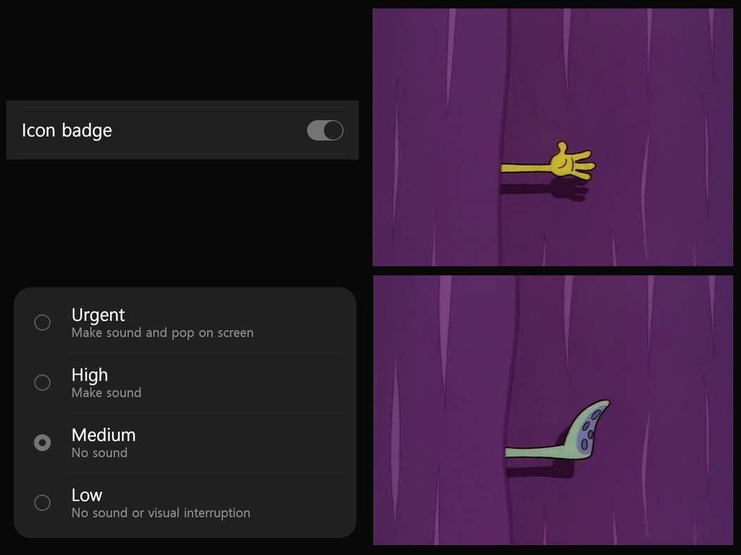
To me, it is clear that the UI should make much, much heavier use of checkboxes / toggle switches:
Notification Channel
Enabled
Vibrate
Sound
Status bar
Popup
Badge:
No badge
Dot badge
Number badge
Wake screen
Blink LED
LG Bubble
LG Sidelight
et cetera
Some notes:
- I think it's unlikely that you'd want popups but no status bar icon. I also think it's unlikely you'd want sound with no visual. But the whole point of this exercise is to show that the Android developers' decisions of what I'm likely to want were not good enough, and I'd be foolish to make the same mistakes in my own suggested fix!
- The global badge style setting is unnecessary: if an app has one channel set to number badges, and another channel set to dot badges, numbers should take precedence when rendering.
- The system volume level always wins. The sound checkbox would do nothing when you're in vibrate mode, and so forth.
Now, you'd probably want to have a page for configuring the default settings to apply to new and unconfigured apps. Then, perhaps, each of these checkboxes would be replaced with a choice of explicit yes, explicit no, and follow default. The UI should also remind you what your default is set to, so you don't have to cross-reference it.
And that's it. All you need is one menu for setting the default configuration, and one menu for configuring real channels. No more of this scatterbrained, ten screens of goose chase UI. Just let me control my device!
Contact me: writing@voussoir.net
If you would like to subscribe for more, add this to your RSS reader: https://voussoir.net/writing/writing.atom